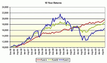
Any client who has invested with us should remember answering question 6 of our risk profiler. When shown the chart below, clients are asked;

The chart above shows the return on £10,000 invested in three different investments (Funds A, B & C) over the last 10 years. Given the potential gain or loss over the whole 10 year period, where would you invest your money?
It’s a loaded question.
A few clients want the biggest return and guess that over the long term “Bold as Brass Blue” should prevail. They are the risk takers of the world and can withstand short term shocks.
Most clients simply look to the end of the period and select “Steady-Eddy Red”. The path has been steady with no nasty surprises. Just what we want for our life savings.
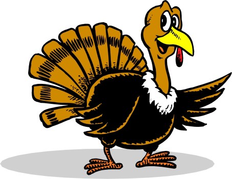
It’s a good question. It’s just a deceptive chart. The world carried on after 2005. Which leads me to my favourite Turkey story.
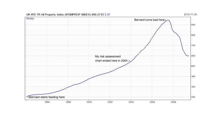
Everyday Bernard came across and fed the birds. They loved him. They let him stroke them. They followed him around the yard. Bernard was the most generous, friendly human in the word. “Humans are our friends” they would say. Why wouldn’t they, they got fed everyday, just like the last day. I guess you can see where I’m going with this story can’t you? Yep. Then they were stuffed and served with cranberry sauce. Yum yum.
If the turkeys were investors, they would be blinded by “Recency Bias”. The human affliction that takes learning from recent past experience a bit too far. Blindly expecting what has happened in the past to continue, without question, is not very wise.
The little risk assessment chart above was not based on fictitious data, it was based on real numbers. The Blue Line was the FTSE100 index and the Red Line was the UK Commercial Property Index (IPD). Now let’s look at just what really happened after the chart above ended in 2005.

Whoops! A very swift 37% fall. Investors cried foul. (pun intended) Commercial property funds were forced to bring in their drawbridges and shut the door to withdrawals. In some cases it took investors 6 months to get their money out back in 2007.
QUESTION: How could such a low risk investment suddenly lose so much?
ANSWER: Low volatility isn’t the same as low risk.

So what was the Goldilocks Green Line on the risk assessment chart? I will tell you next time.

