I thought it would be of benefit to my fellow investors to know just what’s important to me at the moment and what isn’t. What am I using as my guides – more importantly what am I avoiding as just sensationalist.
News of little use to us investors.
Firstly it’s important to stress that periods of strong performance are followed by brief periods of losses. Periods of losses always turn into a following period of strong performance. Day turns to night, night turns to day.
The media suggest day turns to night, night turns to more night. So yes I ignore most of the easily available UK media. Specialist financial or the BBC. Useful if you separate the newsflash from the biased speculation but that job becomes tedious. After a while they make you feel not only unbalanced, but an outright conspiracy theorist for daring to disagree with them.
Let’s get this straight. The media that we watch and read just isn’t interested in us as investors. In fact much of the mainstream UK media is curated by individuals who came through our tertiary education system at broadly the same time and so were subject to the sort of anti-capitalist ideologies still prevalent today. Socialism is perfect, but it still needs paying for. Either you believe in capitalism or you don’t, but as investors it’s our job to provide the capital needed by growing businesses and there should be no guilt in being rewarded for the faith needed to invest in those businesses.
News that we must pay attention to.
I love the phrase “Skin in the game”. For those uncertain of what it means, here is a explanation
“Skin in the game is a phrase made popular by renowned investor Warren Buffett referring to a situation in which high-ranking insiders use their own money to buy stock in the company they are running”.
So yes, I do have more faith investing in businesses where those in control also get cut when things go wrong, but prosper when the businesses they run do well. Here at H.J.Scott & Co. we are hurt when clients investment fortunes suffer, but also prosper when clients prosper.
Therefore I only watch indicators and read the comments of fellow investors who also have skin in the game. They are not writing from the cosy position of a journalist with a final salary pension scheme holding nothing but cash ISAs.
Important Caveat
It is possible to bend the market into your way of thinking. If a prominent investor is asked what is going to happen on TV, they will always talk up their current investment position. By that I mean, if they are betting things will get worse and they have $billions wagered against a stock market rally, do not expect a balanced opinion. Neil Woodford used to be transparent on the investments he bought, it was however the beginning of his downfall. When Neil invested in a business, he broadcast it. Other individuals followed – driving the price up. Genius! Except once the market had gone too far – too fast, larger investors bet against that share falling, which it always did after the initial flurry. The falls forced Neil to sell at a loss and eventually the “bigger boys” forced him out of business as many, many retail investors lost a very large proportion of their life savings.
The most important source of information.
This can be summed up in one word. Price. Price doesn’t lie. Price doesn’t have an opinion. Price is real. You don’t believe the price? You think it’s too high? You think it’s too cheap? Tough! It is what it is. Real people with real skin in the game have bought or sold at that price. Not at a higher price because they wouldn’t accept a lower bid, not at a lower price because they felt the buyers were too generous. They sold at what they could, buyers bought at what they had to. Price is the only bit of market data that carries no opinion. It is truly important data. More importantly price has a history when viewed in a chart.
Charts
Every share has a chart, a history of when it gets too expensive and when it becomes cheap. A market has a chart – but remember a market is simply a collection of shares that each have a chart. Most markets are biased towards the largest companies in the index. Therefore a market can only rise when its largest constituents rise, a smaller share can have an amazingly successful time and not move the needle on the market chart one iota.
I look at hundreds of charts. Some all the time, others become important only in times of stress. So what’s the most important chart to me at the moment? The Dollar index.
Don’t Fight The FED
In the years after the Great Financial Crisis devastated the U.S. economy in 2008, Wall Street fell in love with an old mantra: “Don’t fight the Fed.”
The phrase was coined in 1970 by Martin Zweig, a finance professor and famed investor, to explain the strong correlation between Federal Reserve policy and the direction of the stock market.
Federal Reserve policy is used to slow down overheating economies or save economies on the brink of a melt down. If the FED is injecting capital and reducing interest rates it is usually good for investors, if it is increasing interest rates and withdrawing capital it is difficult to make money. Thankfully periods of tightening are usually short in duration, but alas, that is where we find ourselves currently. All eyes are on when the FED tightening ends. So far there have been several “false summits” that have wrong-footed myself along with most other investors. Just as it looks like the tightening period is likely to come to an end, another crisis appears that kicks the can and the timescale down the road. Ukraine, stickier than projected inflation, what’s next? Italy reverting to the Lira? Who knows. But all things always pass.
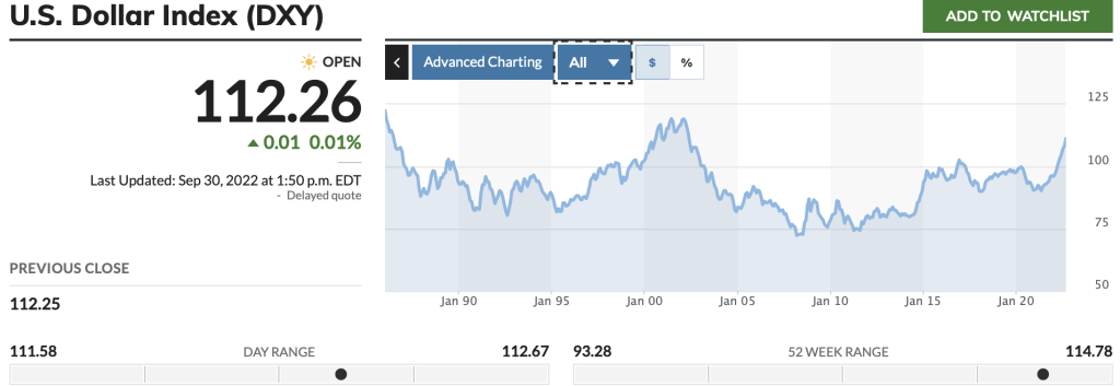
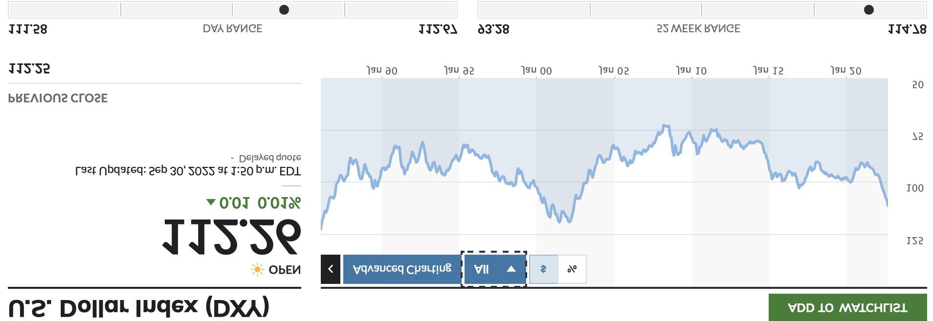
The best chart to sum up where the extremes of FED policy have gone in the past is the Dollar Index. I have mentioned this index a few times in blogs this year. The higher US interest rates go, the worse stock markets perform. Why try to get a return from shares when you can simply own Dollars and get a reasonable return with no risk. However every time the index retreats a little, share prices globally stage a recovery.
The Dollar Index

The mainstream media have been quick to criticise the recent financial statement, but the demise of Sterling needs to be seen in context. As I have tried to make clear for a while now, the UK is not an isolated basket case – EVERY currency has suffered against a strong Dollar. Many currencies now at 30 – 40 year lows against the Dollar.
This Dollar strength needs to end at some point or it becomes not a problem for most currencies, but a problem for the US itself. Are there any indicators where this strength should end? Yes, in the history of the Dollar index price. I believe we are close to that point. Shares move inversely to the index so the next bull market should start weeks or months from now if history proves to be a good indicator. I didn’t make a mistake by inverting the Dollar Index above – I did it to show how shares perform when the dollar increases and then decreases in value. The recovery globally should start as soon as all countries are forced to increase interest rates in the short term to stay instep.


Howard were all not sleeping but hopefully we can all be better and stronger soon. Take care young man .
No kisses